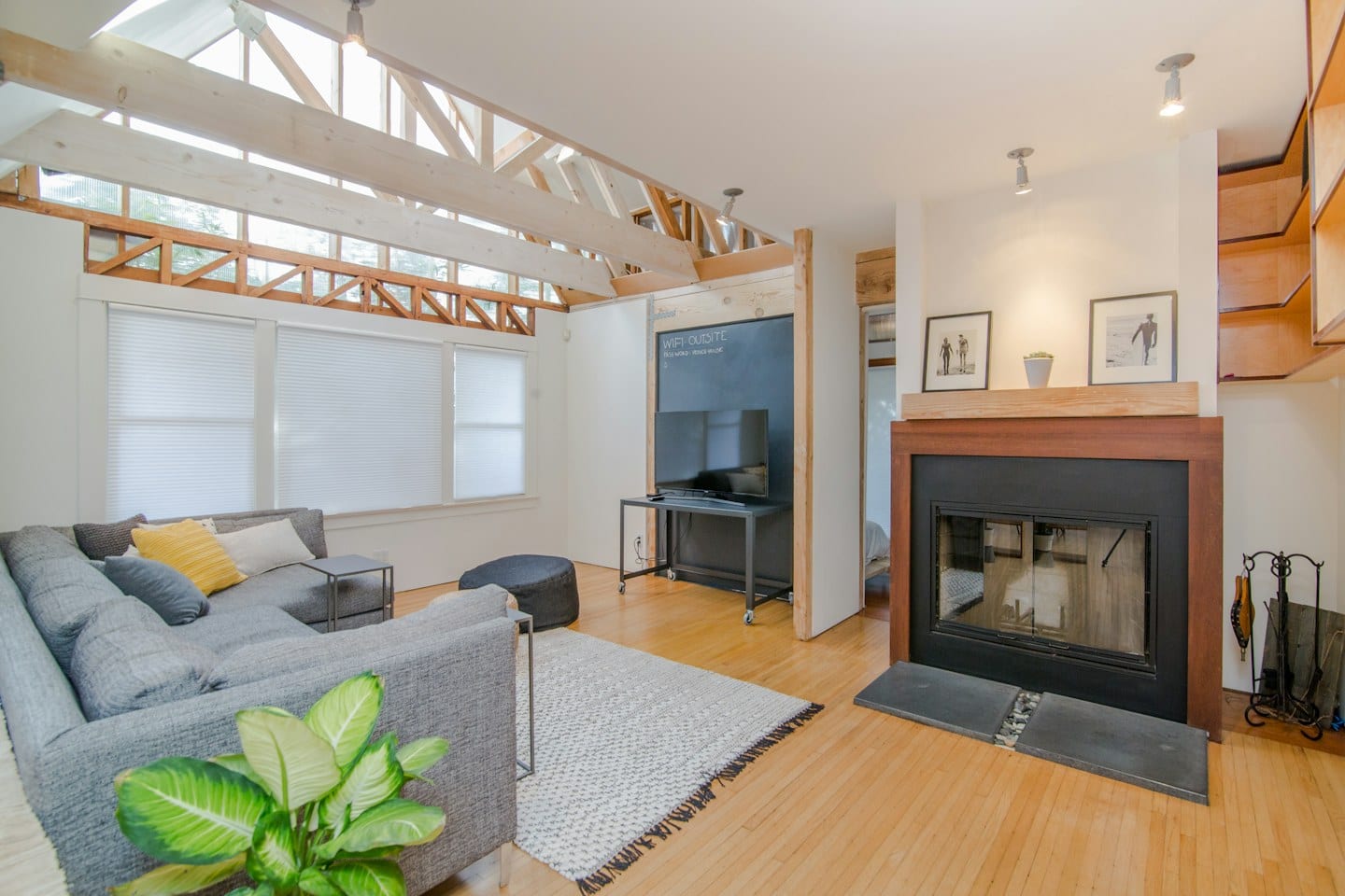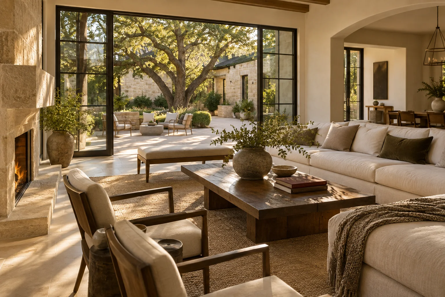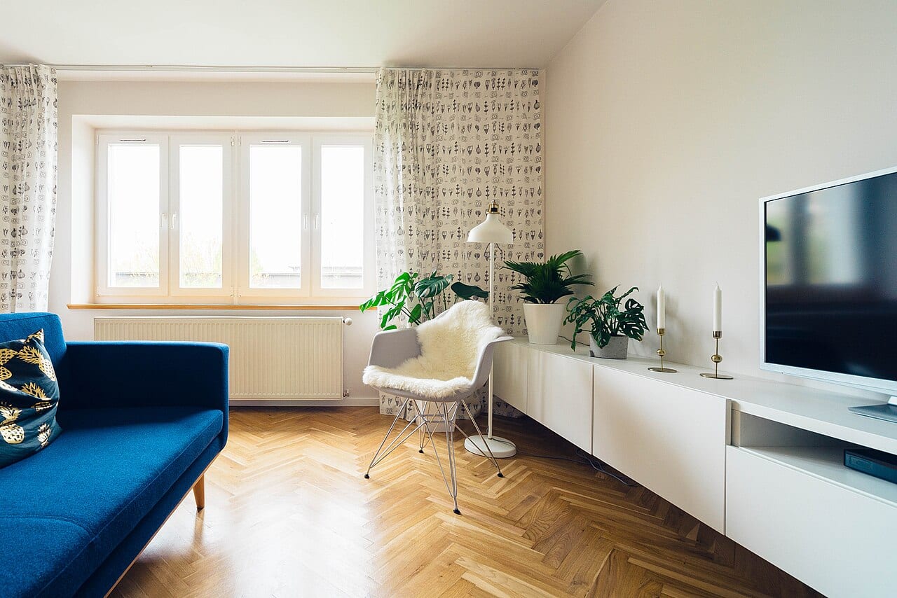
Selecting a new wall color often begins as a collection of disparate ideas. You might find a soft neutral in a magazine, a deep navy on a designer’s social media feed, and a warm cream from a local showroom display. When these various inspirations converge on your dining room or bedroom, the challenge is no longer finding a color you like, but determining which specific shade behaves correctly within your unique environment. Because your inspirations come from different places, they may not react to your home's light in the same way.
The Trap of Disconnected Samples
It is easy to fall into the habit of looking at small paint chips held against a white background or viewed under the bright, sterile lights of a retail store. However, a color that appears crisp in a shop may look muddy or overly yellow once it covers several walls in your home. The primary tradeoff involves the convenience of quick decisions versus the time required to observe how light interacts with a large surface area. Relying on a tiny swatch provides an immediate sense of color, but it lacks the context of scale and depth.
For example, if you are choosing between a light gray and a pale beige, the difference might be imperceptible on a tiny swatch. You might find that the gray looks perfect in the morning but turns a cold, blueish hue by sunset, while the beige feels cozy at noon but seems dull under your evening lamps. Without testing them in situ, you are choosing based on a fragment of the truth rather than the full picture provided by your actual architecture.
Organizing Your Observations
To compare these sources fairly, you must treat your walls as a laboratory. Instead of keeping the swatches in a pile, assign a clear, personal label to each one. Use a piece of painter's tape to write the source or the name of the color directly on the sample. This prevents the confusion that arises when three different 'eggshell' tones begin to look identical after a few days of sitting in the sun. Organization is the key to maintaining a clear memory of which shade corresponds to which inspiration.
Apply these samples to the actual walls where the color will live. Aim for a section of the wall that is large enough to show the color's character but small enough that it does not dominate the room's existing decor. If you are working with several different brands or collections, this method allows you to see how they sit side-by-side in the same light. This direct comparison is the only way to see if a brand's 'warm white' is actually warmer than another brand's 'off-white' once applied to your specific surface.
Timing the Test
A single glance at noon is rarely sufficient. To make a confident decision, observe your labeled samples at various intervals throughout a typical day. Look at them during the bright morning hours, in the heat of the afternoon, and under the specific artificial lighting you use for evening relaxation. Ask yourself how the color shifts as the natural light fades. If you find yourself struggling to reconcile a color you loved in a catalog with how it looks on your wall, consider the surrounding elements. Ask how the color interacts with your flooring, your upholstery, and the direction your windows face. Once you have observed the samples through different cycles of light, you will be able to select the shade that feels most consistent with your daily life.